3 Things You're Doing Wrong on Your Website
Building or rebranding your website is a pain a work of love! 😂 While working on the website, we all get to the point of thinking- let's get it over with and then move on with our lives! Unfortunately, your website can't be a static and "let's just forget about it" part of your business. You have to monitor it and update it and, most importantly, you have got to be sure your website represents you and your work in the VERY best (& current) way possible. There are 3 mistakes you may be making that could keep you from getting those fabulous new clients you're looking for! Are you guilty of any of these??
1. You Never Ever Update It
You forgot about your website after copyrighting it in 2018, didn't you? You thought you could just put up a pretty site and then get back to your very long to-do list. Nope. There are some VERY important reasons to keep your site up to date. First, if you add new content to your site on a regular basis (ahem - BLOG), then Google will rank your site higher than another just like it. That means your clients will see it more quickly and more often in a search. Second, you have GOT to update your portfolio when you have new photos. I know that can be a pain (especially after this past year!), but it's the BEST way to get new clients. Gorgeous photos are really the most important thing about your website. You need them to be crisp, clear, styled to perfection, and they need to be fresh. I have seen way too many websites where designers have left their work up forever - even when someone can clearly see the potpourri bowl that screams "I'm an old project!" And have you added services? Have you dropped services? Do you need a new personal photo? Keep your site current and complete!

2. Your Contact Info Is Missing
I know you want everyone to fill out that form no matter what, but it can be very irritating to a prospective client. In fact, one of the top complaints from people landing on websites is when there is no way to get in touch. No, you don't have to put your own email address or your phone number. But you should at least have an email address like info@ or hello@. It's a psychological trick that makes people think that they are able to take action and that you are a person who wants to hear from them. You can always ask them to go back and fill out the form - but you should at least give the perception that you WANT to hear from clients.
3. Your Website Isn't Responsive
Okay, if you don't know what that means - a responsive website looks equally good on a desktop and on a mobile device. Check your website right now on your phone...how does it look?! Right now, over 50% of people who are hitting your website are on their phones. Possibly even more. So if you're making it difficult for them to navigate on their phones, you're going to lose clients. No one has the patience anymore to find other ways to get to your site - they'll just disappear. Don't let them leave because your website doesn't look good on their phones!
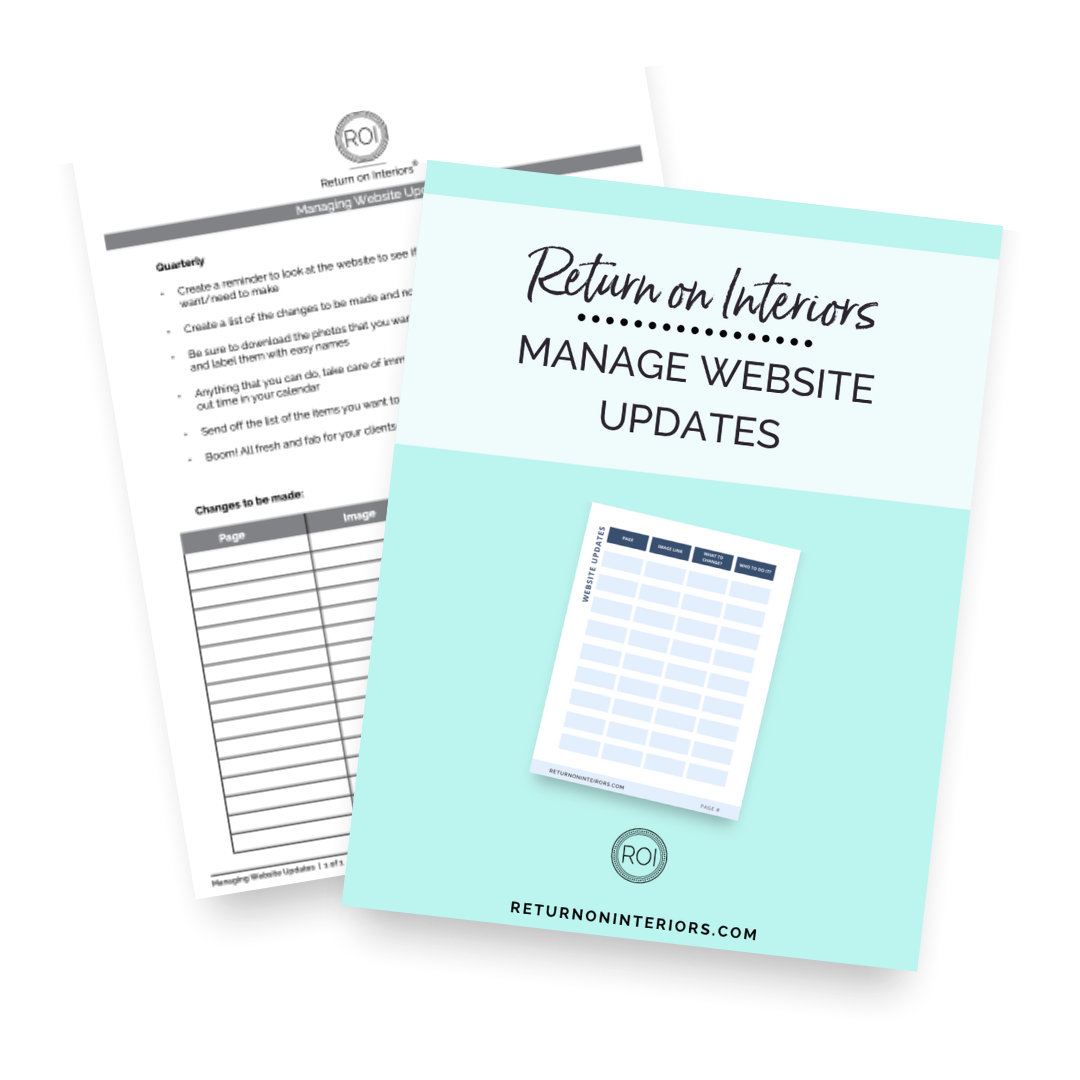
One extra hint: If you're on a WordPress site, be sure you check it carefully after WordPress does automatic updates. Those can often cause issues with how your site looks, so watch out for that. And to help you with ALL of this, download my FREE Managing Website Updates Guide! It will help you juggle your site and your to-do list!


